*This post MAY contain affiliate links. That means that if you make a purchase after clicking on a link I may earn a small commission at no extra cost to you. I don’t ever recommend something that I don’t use myself. Not all links are affiliate links. For more information, see our Privacy Policy.
To print this page, click the green Print button below the article. If that doesn’t work, try Ctrl + P (or Flower + P) to bring up the printer dialog box.
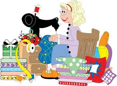
What Kind of Quilter Are You?

To find out, just tell our fortune-telling quilter your name and she will tell you!
Use lower case letters, please.